14 Dashboard Design Principles Any Top Management Will Appreciate
Dashboard design principles and best practices the rise of innovative, interactive, data-driven dashboard tools has made creating effective dashboards
In the digital age, there’s little need for a department of IT technicians, plus a graphic designer, to create a dazzling data dashboard. However, if you want to enjoy optimal success, gaining a firm grasp of logical judgment and strategic thinking is essential – especially regarding dashboard design principles.
Dashboard design should be the on top of your business reporting.
Here, it can get carried away by your creativity and designing colourful dashboard. Unfortunately, you must not play with it, There are dashboard design best practices you should follow to display your data in the best way, making it easy to analyse and actionable.
Business dashboard should be user-friendly and constitute a basic aid in the judgment-making process. To help journey to data-driven success,
I’ll go over these dashboard design guidelines to ensure you don’t miss out on any vital steps.
1. Consider your end goal
Like Strategic, Operational, Analytical, Tactical.
2. Don’t try to place all the information on the same page
You should never create dashboards that’s fits for all possible requirement and don’t chock up all the information into the same page.
3. Choose relevant KPIs
Your KPIs will help to shape the direction of your dashboards as these metrics will display visual representations of relevant insights based on specific areas of the business.
4. Provide context
Always try to provide maximum information, even if some of them seem obvious to you, your audience might find them perplexing. Name all the axes and add titles to all charts. Remember to provide comparison values.
5. Make it as easy as possible
That said, you should never lose sight of the purpose of designing a dashboard. You do it because you want to present data in a clear and approachable way that facilitates the decision-making process.
6. Choose your layout carefully
If your dashboard is visually reorganized, users will easily find the information they need. Improper layout forces users to think more before they grasp the point, and nobody likes to look for data in charts and numbers. I will make users smart when they are focused what to do with the data rather than thinking what or were to find data in dashboard.
7. Prioritize simplicity
Don’t waste space on useless decorations, like lot of pictures.
8. Be careful with colours – choose a few and stick to them
The modern dashboard is minimalist and clean. Flat design is really trendy.
Now, when it comes to colour, you can choose to stay true to your company identity or go for a totally different colour palette. The important thing here is to stay consistent and not use too many colours, an essential consideration when design a dashboard.
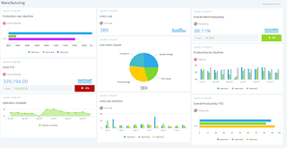
Manufacturing Production Dashboard displaying main manufacturing KPIs such as the production volume, active machines, sales revenue, returned items, etc.
9. Don’t go over the top with real-time data
Don’t overuse real-time data. Unless you’re tracking some live results, most dashboards don’t need to be updated continually.
10. Use the right type of chart
It’s important to understand what type of information you want to convey and choose a data visualization that is suited to the task. Line charts are great when it comes to displaying patterns of change across a continuum. They are compact, clear and precise. Line charts format is common and familiar to most people, so they can easily be analysed at a glance.
What kind of charts should be used in a dashboard design based on comparison, composition, relationship and distribution of data.
11. Be consistent with labelling and data formatting
In terms of functionality, the main aim of a data dashboard is gaining the ability to extract important insights at a swift glance. It’s critical to make sure that you're labelling and formatting is consistent across KPIs, tools, and metrics.
12. Use interactive elements
Drill-down is a smart interactive feature that allows the user to drill down into more comprehensive dashboard information related to a particular element, variable, or key performance indicator without overcrowding the overall design.
13. Double up your margins
You should always double the margins surrounding the main elements of your dashboard to ensure each is framed with a balanced area of white space, making the information easier to absorb.
14. Never stop evolving
Asking for feedback is essential. You’ll be able to improve the layout, functionality, look, feel, and balance of KPIs to ensure optimum value at all times.
So, if already have dashboard or thinking of improving it or creating a new one, put your newly-acquired dashboard principles into practice.


